
In all likelihood, you use Microsoft Word regularly, if not daily, to create documents for your teaching and research. However, it is almost as likely that even if you received training on how to use Word, the training was not grounded in practices that ensure your documents are usable for all. Digital accessibility for Word is not difficult, but it may require breaking old habits and creating new ones.
Making your Word documents digitally accessible provides an inclusive learning experience, complies with the University of Missouri System’s Digital Accessibility Policy and fulfills the accessibility criteria of the 4 Pillars Quality Review.
Headings
See Accessibility skills: Headings to learn how correctly structured headings support accessibility.
Text formatting alone is not a digitally accessible way to define headings. Moreover, this is also not the most efficient way to add headings to a document, as the formatting must be applied each time the heading is used. Additionally, if you change your mind about the formatting style for your heading level, you will have to go back through the document and reformat each one.
Using Heading levels in the Styles menu of Word will allow you to create semantic headings—that is, headings that are correctly interpreted by a screen reader—and to quickly apply different formatting to your headings throughout a document.
To access the headings, go to Home in Word and then Styles. You can also choose the Styles Pane, which will stay pinned to the right-hand side of your screen as you work.
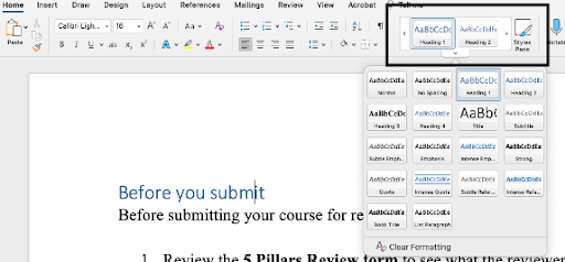
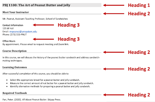
- Heading 1 should be your document title.
- Heading 2 will be your main section heading style
- Heading 3 will be the first subheading style
- Heading 4 will be the second subheading style.
- And so forth.
To update the default styles, apply the formatting you prefer. For example, make the Heading 1 a different font, size 18, bold and black with a light blue background. Right-click Heading 1 in the Styles menu and choose Update Heading 1 to Match Selection.
Lists
See Accessibility skills: Lists to learn how correctly structured lists support accessibility.
Creating a bulleted list
If your items are a group of equivalent ideas or terms, and the order is not an essential aspect of the concept, use a bulleted list.
Unordered (bulleted) list
To make a peanut butter and jelly sandwich, you need:
- Two slices of bread.
- One jar of peanut butter.
- One jar of jelly or jam.
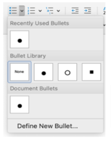
If you type an asterisk (*) and then a space, Word will recognize that you are creating a bulleted list. Or, you can use the bullets function to create and format your list. The default bullet is a solid circle, but other choices include a white circle or a small square. You can add more options, but this is discouraged.
Creating a numbered list
If your items are a sequence, steps to instructions, or an essential part of a whole (such as, "there are four things you need to know to complete this assignment"), use a numbered list.
Ordered (numbered) list
Follow these steps to make a peanut butter and jelly sandwich:
- Spread a layer of peanut butter on a slice of bread.
- Spread a layer of jelly or jam on top of the peanut butter.
- Place the second slice of bread on top of the peanut butter and jelly.
- Slice your sandwich diagonally.
- Enjoy!
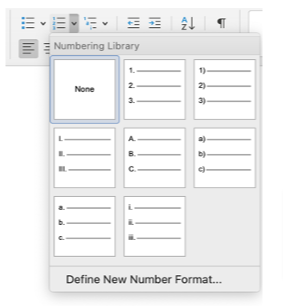
There are two ways to create a numbered list. For a numbered list, if you type the number "1" followed by a period, Word's auto formatting will recognize that you are creating a numbered list. Or, you can begin typing your list and then use the Numbering function to create and format your list. By default, your numbered list will have Arabic numerals, but you can switch to upper- or lowercase Roman numerals or upper- or lowercase letters.
Descriptive links
See Accessibility skills: Descriptive links to learn how descriptive links support accessibility.
To insert a descriptive link into your Word document, begin by typing and then highlighting the text that will be linked. Then, you can go to Insert > Links and choose Link:
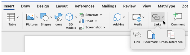
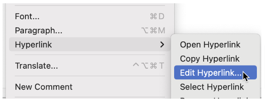
You can also right-click the text and then select Hyperlink..., or you can bring up the same menu by selecting CTRL (on a PC) or CMD (on a Mac) plus K.

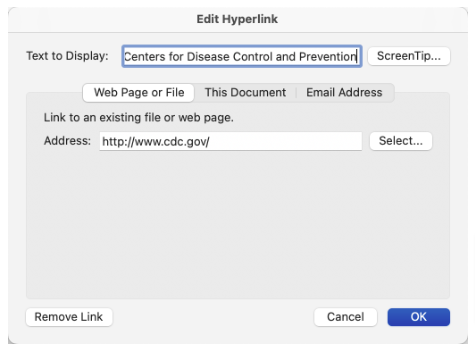
If you have a URL or otherwise insufficiently descriptive link, the Hyperlink... option will allow you to edit the link text:
Type your descriptive link text under Text to Display:
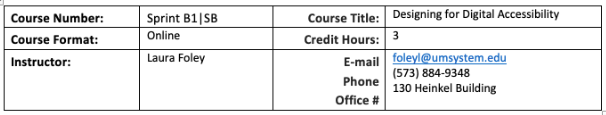
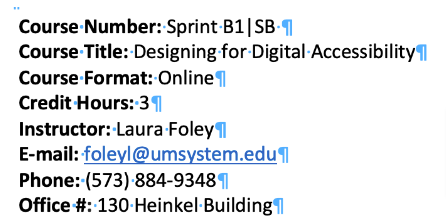
Tables
See Accessibility skills: Tables to learn how correctly structured tables support accessibility.
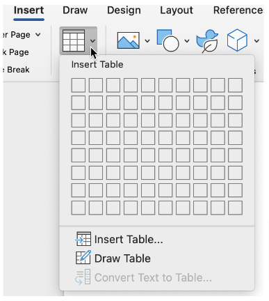
To add a table in a Word document, start by going to Insert and then Table. Select the number of rows and columns for your table; remember, you can add or delete these.
You might be in the habit of merging all of the cells in the top row and then adding your table's title here. Please do not do this, as merged cells are not best practice for digital accessibility. Instead, place the title immediately above or beneath the table.
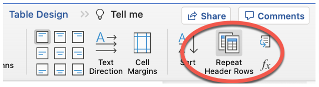
Select the cells in the top row. Go to Layout and then choose Repeat Header Rows. This will define each top cell as the header cell for that column. Also, if the table breaks onto the next page, the header row will repeat; this increases readability for everyone.
Under Table Design, you can choose styles for the borders and colors of your table. However, please be aware that not all available styles provide sufficient color contrast.
Breaking up complex tables
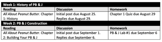
You may be familiar with creating complex tables, such as this syllabus example listing assignments and due dates. However, the use of merged cells is problematic.
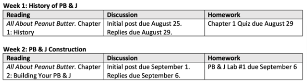
A more accessible design choice would be to break each week into a separate table.
Tables, tabs and columns
Tables, columns and tabs are strategies you might use to control the layout and formatting of your document. Which technique you should use depends on the purpose.
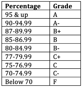
To display information, such as your grading scale, use a table rather than tabbing (or spacing) across to create the appearance of a table or column. In this first example, a grading scale has been created with tabs.
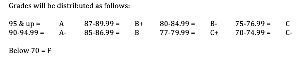
Because a screen reader moves from left to right, this student would hear, "95 & up = A, 87-89.99 = B+, 80-84.99 = B-," etc. — not the order in which the instructor intends to present this information. Using a table makes it much easier for any user, but especially those with screen readers, to scan and see the relationship between each percentage range and the corresponding grade:
However, if you are using tables to control the layout of a page, such as adding the appearance of columns, using the columns formatting in Word is a more accessible way to achieve this.
Here, a table is used for formatting, not to present data. Notice this does not allow the use of headers, which are critical for table accessibility.
To use columns instead, move the information out of the table and make sure there are no extra tabs or spaces in the content:
Then select the content and go to Layout > Columns to apply the column formatting.
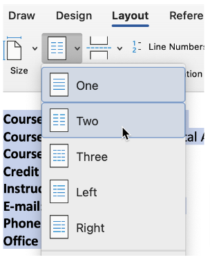
The material is now in two columns. The screen reader will read the content in the left-hand column, followed by the content in the right-hand column.
Color contrast and use of color
See Accessibility skills: Color to review the accessible use of color.
An accessibility check will reliably flag poor color contrast in your Word document. However, the are a few pitfalls to be aware of:
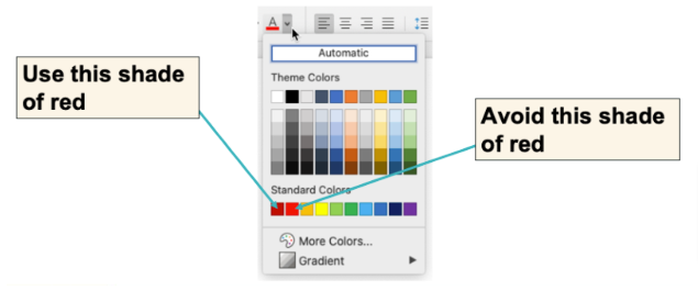
First, primary red that is so often the default for getting a student’s attention does not provide enough contrast with white. Instead, opt for the slightly darker shade of red next to it.
Additionally, do not assume that all Word templates are accessible. Many templates in Word for tables and SmartArt do not provide sufficient color contrast.
Alternative text and accessible images
See Accessibility skills: Images and alternative text to review the accessible use of images.
You probably don't use as many images in your Word documents as in PowerPoint, but you might use some. You might also use text boxes or SmartArt elements; like images, these require alternative text to convey meaning to anyone using a screen reader. You must also provide alternative text for embedded objects, for example, if you embed an Excel table within your Word document.
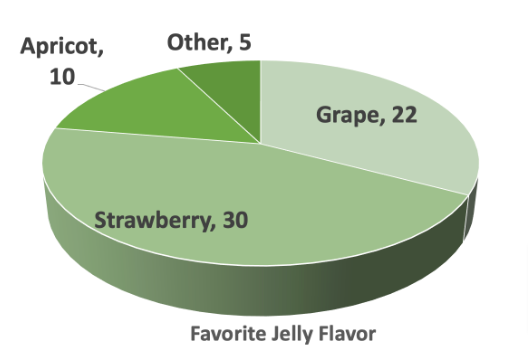
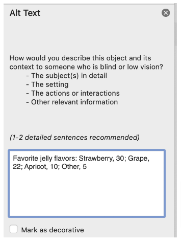
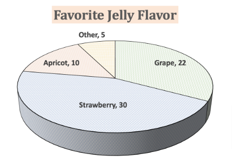
Consider the following pie chart:
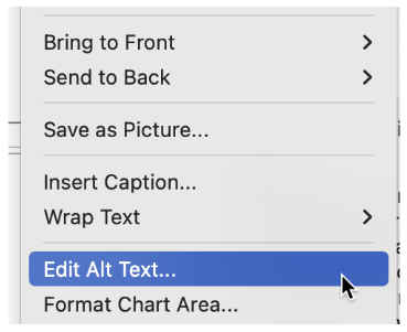
To add alt text to an image or object in Word, right-click the item and then select Edit Alt Text....
Type your descriptive text in the Alt Text pane. You do not need to save.
Creating usable and accessible charts and SmartArt
Adding alt text to your chart or Smart Art is critical, as is providing adequate context in the supporting text. In addition, ensure you are using sufficient color contrast and font sizes. You will likely need to edit the default templates to achieve this.
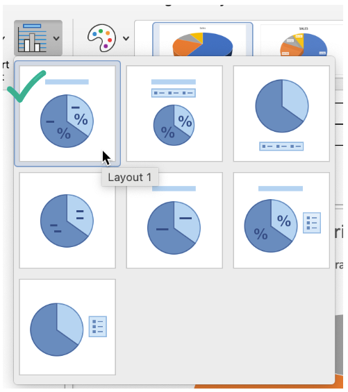
- Add a chart title.
- Under Chart Design > Quick Layout, the best choice is a chart layout that shows each criterion being measured with its count or percentage rather than relying on a separate legend. Otherwise, choose a layout that displays the number.
Right-click any data label and select Edit Data Label to increase the font size, change the font style, or apply bold.
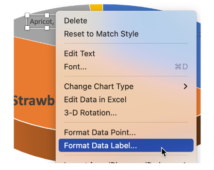
Format Data Point, in the same menu, allows you to customize the fill color, border color, and pattern.
Creating accessible equations
See Accessibility Skills: Equations to review the accessible use of equations.
If your course content includes equations or formulas, you can insert those as images into your documents or slides. Rather than do this and then write alternative text for those equations, you can use the equation editor.
To insert an equation into Word, go to Insert > Equation. This screenshot is from MS Word in Microsoft 365. The equation editing interface opens as a side panel. There are some common equations you can plug in, or you can select the symbols and structures you need to create your equations.
If you are fluent in LaTeX, or have a way of generating LaTeX (more on that later), you can enter your LaTeX code straight into this interface.
Checking your Word documents for accessibility
There is a lot to keep in mind when creating digitally accessible Microsoft documents. Luckily, the Microsoft Accessibility Checker can help you find and address issues in documents you've created previously (before learning about accessibility!). Even after digital accessibility has become a habit, checking your work is a wise final step before sharing your documents with others.
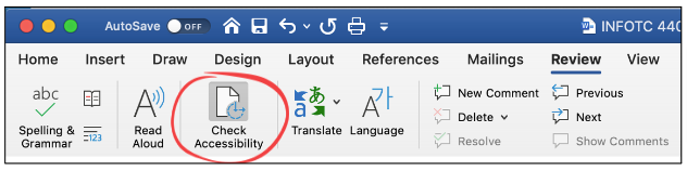
To access the Microsoft Accessibility Checker, go to Review > Check Accessibility.
The resulting report will show you where the errors can be found. When you select an item, the checker will explain why the issue is problematic and how to fix it.
Errors, warnings, and tips
The Microsoft Accessibility Checker will flag issues as errors, warnings, or tips.
Errors include:
- Missing alternative text for images or other objects.
- Missing table headers.
- Images or objects set to "float" next to text.
Warnings include:
- Split, merged or nested cells in a table.
- Lack of sufficient color contrast.
Tips include:
- Lack of headings used in a document.
Issues not addressed
The Microsoft Accessibility Checker does not address semantic lists (numbers and bullets) or descriptive link text. You will need to check your documents to find these—and perhaps enlist a colleague to "peer review" each other's work for accessibility.
Related sprints

Sprint 1.B Designing digitally accessible documents
This sprint will guide you through the core skills of digital accessibility and how to apply those skills in documents.
Learn more
- Word and PowerPoint accessibility evaluation guide. WebAIM.
- Creating accessible documents. National Center on Creating Accessible Materials.
- Caprette, Heather. Best Practices in Accessible Online Design. Pressbooks, Cleveland State University:
- Video tutorials from Microsoft: