
What this means
Effective use of color entails ensuring that there is sufficient contrast between the text color and the background color you have chosen and not relying solely on color to convey meaning.
Why this matters
For users without vision impairments, color adds interest and can even set a tone for a page or a PowerPoint slide. This information is not intended to discourage you from using color in your learning materials!
However, lack of sufficient color contrast can affect users with low vision and certain types of color blindness, as well as users who are on a monitor with poor resolution or using a device outdoors in bright light. For example, one out of every 12 men (and one out of every 200 women) has red-green color blindness, making the use of red and green together problematic.
General tips
- Use the WebAIM Color Contrast Checker to sample foreground (text) and background colors from any page or document to check whether the contrast is sufficient. Note that the UM System strives for compliance with WCAG AA, or WCAG 2.
- Don’t rely on color alone to convey meaning.
- Avoid using primary red (hex code #FF0000; RBG 255-0-0) with white. If you want to use a shade of red, use maroon instead (try hex code #C00100, RBG 192-1-0); in Microsoft, this shade is available right next to primary red.
- Avoid blue text, as students might expect that to be a hyperlink.
Here are tips for providing emphasis without relying on color alone:
- Use color in conjunction with boldface, a larger font, a callout box or border, or an attention-getting icon or emoji. Note that an image would require alternative text, but an emoji does not.
- In graphs, add labels to each section. Consider adding a pattern in addition to the color.
- Use italics sparingly, as large blocks of italicized text can be difficult to read.
- Avoid underlining for emphasis, as underlined text can be mistaken for a hyperlink. Note that all major style guides now recommend italics instead of underlining for citing book and journal titles, and so forth.
Using the WebAIM Color Contrast Checker
Color contrast can be tricky to check in documents because most tools require you to know the color’s HEX codes, a six-character alphanumeric code used to define colors in HTML. However, Office documents and PDFs don’t make it easy to select the HEX code of a color.
Luckily, the WebAIM Contrast Checker allows you to use the eyedropper tool to sample colors from documents. Click the colored rectangle under “Foreground Color” or “Background Color” to bring up the eyedropper tool. Then, click on the color of the document you want to check. Remember that your text color is the “foreground.”
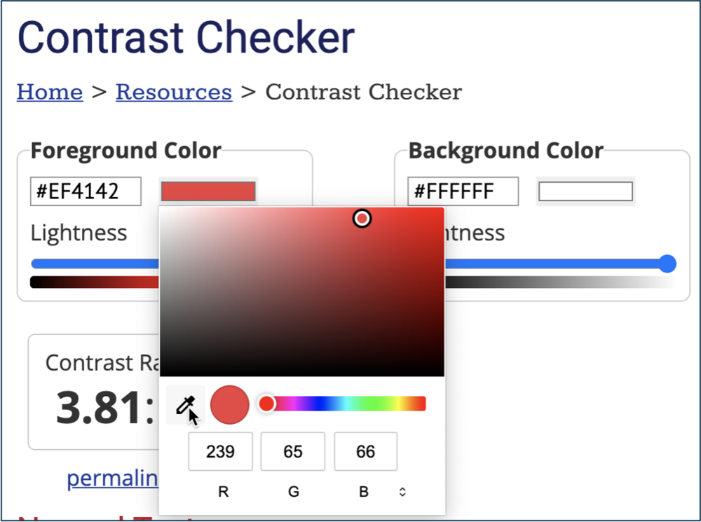
Notice this shows you the RGB value of the color, which you can more easily take back to a Microsoft Office document.
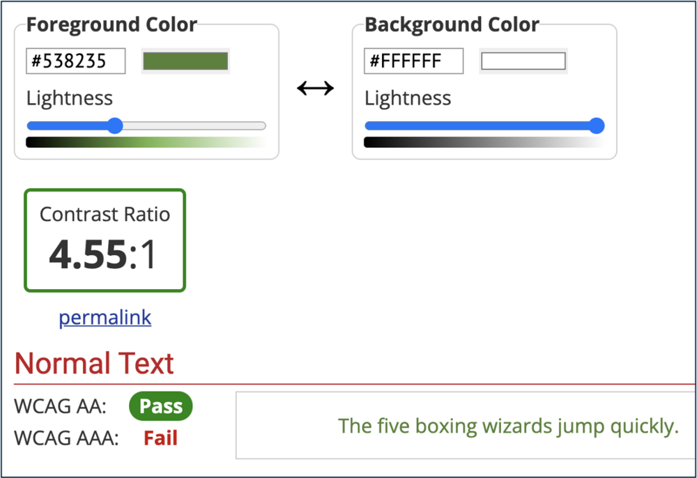
The WebAIM Contrast Checker will indicate whether your color contrast passes Web Content Accessibility Guidelines (WCAG) AA or AAA. The UM System digital accessibility policy requires compliance with WCAG 2, or AA. So this green text on a white background is fine. If your color contrast fails, you can use the “lightness” sliders to find a shade that does work.
This tutorial shows how to navigate between your document and the WebAIM Contrast Checker.
Accessible color palettes for Mizzou
You might find it convenient to simply choose colors that complement Mizzou colors. See MU Brand and Identity: Colors for further guidance. Note: Avoid combinations of gold and white.
Dark Color | Light Color |
|---|---|
| #000000 R-0 G-0 B-0 | #F1B82D R-241 G-184 B-25 |
Learn more
Learn how to use color accessibly:
Resources
- Use of Color (Level A). W3C Web Accessibility Initiative.
- WebAIM Color Contrast Checker
- From the ADA National Network:
- Color Contrast. [Video]
- Use of Color Alone to Convey Information. [Video]
- Color and Contrast. Deque University.
- Color Theory. From DiPeri, Dawn Lee. Graphic Design for Course Creators. Pressbooks.
- Avoiding the Use of Color Alone to Convey Meaning and Algorithms that Help. From Caprette, Heather. Best Practices in Accessible Online Design. Pressbooks, Cleveland State University.