Beautiful things work better.
Don’t believe me? Take a look at the research. A study done in Japan showed that users were more successful in their operation of an ATM with an aesthetically-pleasing interface than one with a less attractive appearance. Researchers in Israel doubted the findings, so they conducted their own study. And got the same results.
The takeaway is that people are more relaxed around an attractive object (and this includes Canvas courses). And relaxed is good when it comes to user experience – relaxed users are more open to looking for solutions and finding their way through a process. On the other hand, a design that’s painful to the eyes makes the user tense, and tension leads to tunnel-vision and frustration when navigation doesn’t go smoothly.
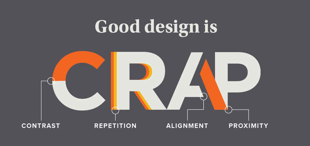
So how can we design beautiful Canvas courses that lead to easier navigation for students? It’s a question that someone could spend a whole semester on, but since I only have a few paragraphs, I’ll just give you the straight C.R.A.P. That is, the design principles from Robin Williams’ (not that one) book The Design Book for Non-Designers: Contrast, Repetition, Alignment, and Proximity.
- Contrast is baked into Canvas – pages, discussions, assignments, etc. all look a little different. But you can increase the contrast between them by using indenting in Modules or separating them with text headers. Using headings in your content pages also breaks up bodies of text and makes it easier to navigate for screen readers. If color is used in your content, use a color contrast checker to make sure it's readable.
- Repetition makes Canvas navigation much easier for students. Each module, page, discussion, etc. should have the same design as the others in that group. Repetition is also important in file and page names: mixing naming styles (e.g. “Assignment 1” and then “Week 2 Homework”) can lead to confusion and frustration.
- Alignment is the spatial relationship between different elements; on Canvas modules, this is a downward scroll, so a sequential order usually works best. But if you’re designing your own pages, consider where you place the different elements. Where does the user’s eye go first?
- Proximity is how close elements are to one another. Thinking again about modules, you’ll want similar items closer together: readings next to other readings, assignments next to other assignments. And in the Assignments section in Canvas, use Assignment Groups to put related assignments together. (Bonus: you can use these to weight your grading as well).
There’s way more that can be said about making Canvas courses pretty. But no matter your skill level, there are ways you can improve the look and feel of your course by following the C.R.A.P principles.
-Kris Wingo, Instructional Designer
