
Creating accessible pages in Canvas
Making your Canvas materials digitally accessible complies with the University of Missouri System’s Digital Accessibility Policy. Doing so also provides an inclusive learning experience for all students and fulfills the accessibility criteria of the Quality Course Review.
Why use Canvas Pages instead of files?
You may be accustomed to uploading files directly to Canvas and less familiar with creating Pages or entering your assignment or quiz instructions directly into the platform. However, there are reasons to put that content into Canvas Pages instead:
- If you need to edit your information, you can do so directly within Canvas. You do not need to download, revise and re-upload a document.
- This saves students the steps of previewing or downloading a separate file; all the information they need is available on the first click (or tap).
- Canvas is optimized for multiple screen resolutions, including smartphones, which many students use regularly to access course content.
Meet the Rich Content Editor
To understand how to create digitally accessible Canvas content, you first need to understand the interface you'll use to create that content: the Rich Content Editor. Watch the following video for an overview:
Headings
See Accessibility skills: Headings for an overview of how correctly structured headings improve accessibility.
To turn a line of text into a heading, place your cursor within that line of text and then pull down the Paragraph menu in the Rich Content Editor to find and select your heading level.
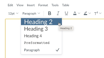
IMPORTANT: By default, the title of your page or item in Canvas is a Heading 1, so this option is not available in the Rich Content Editor. Your first heading must be Heading 2.
Lists
See Accessibility skills: Lists for an overview of how correctly structured headings improve accessibility.
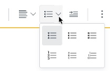
If you copy a semantically structured list from a Word document into the Rich Content Editor, that list should remain as you formatted it, but it is possible you may need to reformat it. If you are creating content from scratch, follow these instructions to create your lists; unlike Microsoft, Canvas does not auto-format lists.
The Rich Content Editor offers options for creating both unordered and ordered lists:
Creating accessible links in Canvas
See Accessibility skills: Descriptive links for an overview of how descriptive links improve accessibility.
Descriptive links to URLs outside Canvas
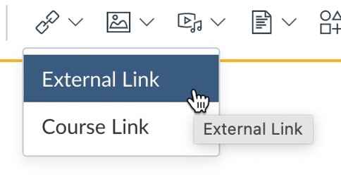
By default, when you paste a URL into Canvas, it is automatically converted into a hyperlink. However, you must follow a few extra steps to provide descriptive links for your students.
Type your descriptive link text and highlight it with your cursor, then click the link icon from the Rich Content Editor. Select External Link.
Paste the URL in the Link line of the dialog box.
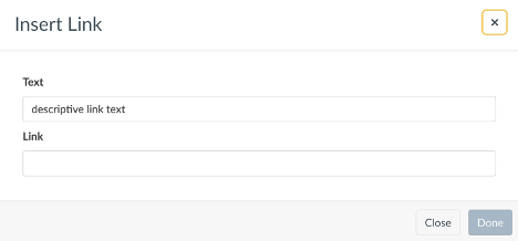
HINT: You can bring up the same dialog box by highlighting your descriptive link text and then selecting CTRL+K (on a PC) or CMD + K (on a Mac) on your keyboard.
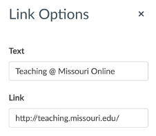
If you have already pasted the URL into the Rich Content Editor, select it and choose Link Options.
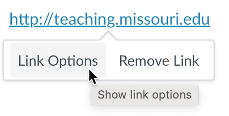
Type your descriptive text in the Text line.
Linking to Canvas course content
The Rich Content Editor allows you to cross-link to other parts of your Canvas site; for example, you can add a link in an announcement to an upcoming assignment. This can be useful for you and your students, but take care that these links are also descriptive.
Cross-linking to other course content
The Content Selector in the Rich Content Editor allows you to link to:
- Pages
- Assignments
- Quizzes
- Announcements
- Modules
- Links that are active within the course navigation (e.g., the syllabus)
To add these links, follow the same process for linking to files, but see Course Link and Links.
Linking to files
If you insert a file into a module or the Rich Content Editor, by default, students will see the file name. In the Rich Content Editor, there are two ways to make this link descriptive.
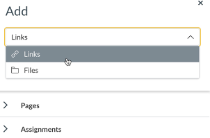
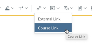
You can begin with your descriptive link text in context. Highlight those words with your cursor, then click the link icon in the Rich Content Editor and choose Course Link.
From the course links menu, choose Files.
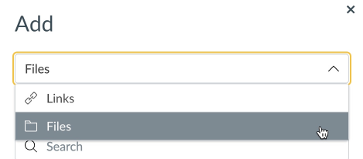
Then browse to the file you wish to link.
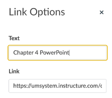
If you have already embedded the file within the Rich Content Editor, you can select the link, then Link Options.
In the dialog box, change Text to descriptive text. Then select Done.
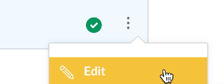
If you have linked a file from a course module, click the vertical ellipsis to edit the file name.
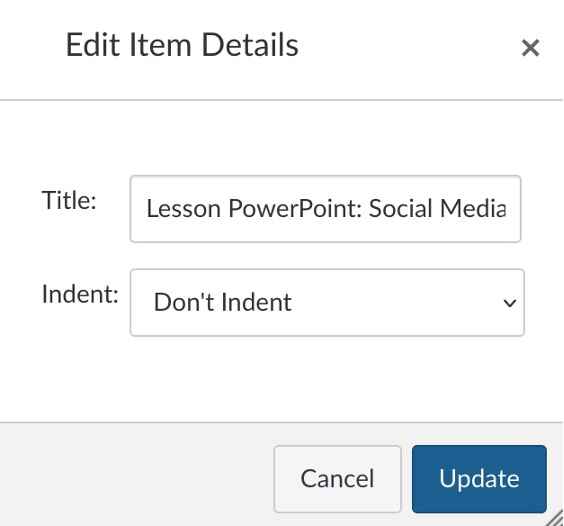
Then, replace the Title with descriptive text — and don't forget to Update.
For hyperlinks that allow students to download different file types (e.g., QuickTime movie, PDF, Word document), it can be helpful to include the file type in the name of the hyperlink itself. This is not specifically an accessibility issue, but it allows the user to determine how large the file will be and whether their connection speed will support such a file size. Here are some examples of including the name and file information in a hyperlink:
- Adobe Acrobat Datasheet (PDF, 500K)
- Course Syllabus (PDF)
- Letter of Introduction (Word Doc)
- View Introduction and Welcome (QuickTime MOV)
Link colors
One Canvas-specific tip to keep in mind is that the default link color in Canvas does not provide enough contrast with most available background colors. You will need to either use only very light background colors against a link or change the link color (which you can do with the color palette in the Rich Content Editor).
See Accessibility skills: Color for an overview of how to use color for accessibility.
Creating accessible tables in Canvas
See Accessibility Skills: Tables for an overview of how to create accessible tables.
IMPORTANT: If you define the table headers in your Word document and then copy and paste that table into the Rich Content Editor, those headers will not be defined in Canvas. You will need to follow the steps here to re-create these accessibility features.
Add a caption
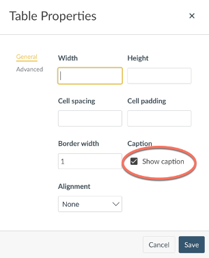
Remember that a single merged cell at the top of your table is not a correctly defined caption. But you can add this in the Table Properties in Canvas:
- Select your table.
- From the menu or toolbar, go to Table Properties.
Check the box to Show caption. Make any other changes, then Save.
Image
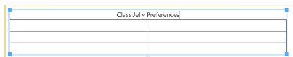
A blank line will appear over your table; type your caption here.
Image
Define header cells
Header cells are critical for telling a screen reader which cells are the headings for the rows or columns in the table. Again, formatting alone cannot define your header cells. You must indicate which cells are headers and whether they are column or row headers. (Depending on your table structure, you might need both.)
- Place your cursor in the cell you need to define.
- From the menu or the toolbar, choose Table.
- Choose Cell and Cell Properties.
- Define the cell type as a Header cell.
Define the scope: Row, Column, Row Group, or Column Group.
Image
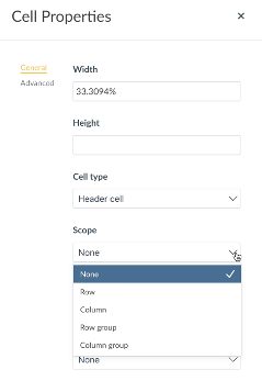
Note: By default, text in header cells is bold and centered, but you can use the formatting options in the Rich Content Editor to override this.
Add a caption
The Canvas accessibility checkers will flag a missing table caption as an accessibility barrier that you must address. While table captions are not required to meet WCAG 2.1 guidelines, they can provide a brief description and context. Captions are helpful if your document contains multiple tables, especially if you are numbering tables or figures sequentially (e.g., Table 2.1, Table 2.2).
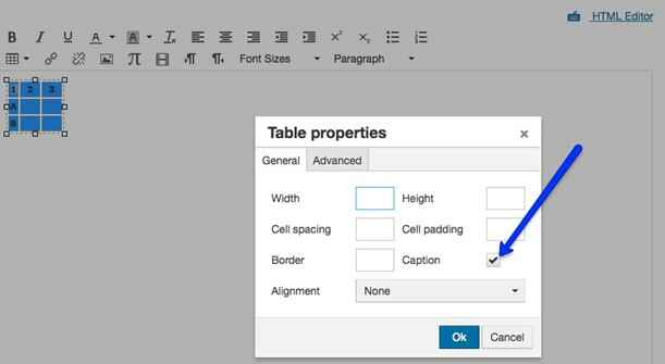
Follow these steps to add a caption to a table in Canvas:
- Select all of the cells.
- In the Table menu, select Table properties.
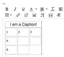
Select the box next to Caption (See Fig X).
Image
Figure X: Turning on captions in table properties.
Enter the caption (See Fig. Y).
Image
Figure Y: Caption in a table header row.
Using images accessibly in Canvas
When you initially upload an image to Canvas, the dialog box includes options to add alternative text or to mark the image as decorative.
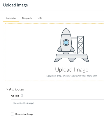
IMPORTANT: DO NOT mark the image as decorative if it conveys information students need to learn the content presented. Your page will pass an accessibility check, but you are not providing a truly equitable and accessible learning experience for all students.
If your image has already been inserted into the Rich Content Editor, click it and select Image Options.
- Upload or embed an image.
- Click the image, then Image Options.
- Add alternative text in the dialog box that appears, or check Decorative Image.
Equations in Canvas
See Accessibility skills: Equations to review the accessible use of equations.
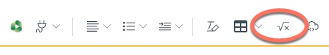
If you need to include equations in your Canvas content, use the Math Editor in the Rich Content Editor rather than embedding an image of the equation. This will render the equation in a format a screen reader can interpret and does not require alternative text.
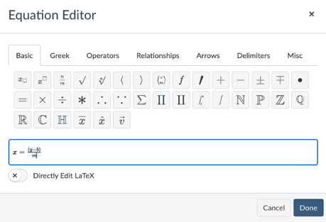
Find the Equation Editor by selecting Insert and then Equation, or look for the equation button in the Rich Content Editor, which is the square root of x.
The Canvas editor allows you to type equations directly into the interface. If you are comfortable creating LaTex or are working with a LaTeX editor, you can also enable direct LaTeX editing and either type or paste your LaTeX here.
Accommodations in Canvas: Timed assessments
Although Mizzou Online promotes proactive accessibility that should reduce the need for accommodations, sometimes accommodations will be necessary.
One of the most frequently requested accommodations is extra time for timed assessments. Once you have published a Canvas quiz, you can use the Modify Quiz settings to provide extra time for specific students. See Once I publish a timed quiz, how can I give my students extra time? in the Canvas Instructor Guide to learn how.
Checking accessibility in Canvas
You can check Canvas accessibility immediately within the Rich Content Editor and scan your entire Canvas site with Ally. Let's look at each:
Canvas accessibility checker
The Rich Content Editor has a built-in accessibility checker. Look for the icon of the human in a circle in the bottom right corner.
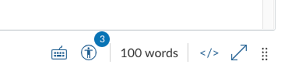
It will also flag errors as you work; look for the badge with the circle indicating the number of flagged accessibility barriers. In the figure above, three issues have been flagged.
The accessibility checker will identify the following barriers.
- Heading paragraphs: Headings should not contain more than 120 characters.
- Sequential headings: Heading levels should not be skipped (e.g. H2 to H4).
- Lists: Lists should be formatted as lists.
- Adjacent links: Adjacent links with the same URL should be a single link. This rule verifies link errors where the link text may include spaces and break the link into multiple links.
- Large text contrast: Text larger than 18pt (or bold 14pt) should display a minimum contrast ratio of 3:1.
- Small text contrast: Text smaller than 18pt (or bold 14pt) should display a minimum contrast ratio of 4.5:1.
- Table captions: Tables should include a caption describing the contents of the table.
- Table header scope: Table headers should specify scope and the appropriate structure.
- Table header: Tables should include at least one header.
- Image alt text: Images should include an alt attribute describing the image content.
- Image alt filename: Image filenames should not be used as the alt attribute describing the image content. Currently, files uploaded directly to Canvas create a redirect that does not properly verify image filenames.
- Image alt length: Alt attribute text should contain fewer than 120 characters.
Note, however, that the accessibility checker in Canvas will not flag all issues. For example, it will not flag links that are pasted in as URLs and lack descriptive text. Additionally, it can determine whether images contain alt text but it cannot determine whether that alternative text is accurate or sufficiently descriptive.
Also, not all of these issues are concrete rules. For example, you might need more than 120 characters to provide sufficient alternative text.
Ally
Ally is a tool in Canvas that will scan your Canvas course site and catch issues that can present barriers for students with some disabilities. It checks announcements, assignments, discussions, pages, the syllabus index and module URLs. The Ally report will flag these issues and provide guidance on how to resolve them.
Scanning your site with Ally
If you do not see Ally Accessibility Report in your Canvas course site navigation menu, go to Settings > Navigation and drag it from the bottom half to the top half, then be sure to Save. (Note that students will not see Ally in their own course navigation, nor can they access any reports.)
Ally will scan the following.
- Canvas pages, announcements, assignments, discussions and quiz descriptions (but not quiz questions)
- Uploaded Microsoft Word and PowerPoint files
- PDF files
- Image files
- YouTube videos that have been embedded within Canvas pages
IMPORTANT: While Ally will scan files and identify potential accessibility barriers, the ability to address those barriers within Ally is limited In many cases, you must download the file and fix it, then re-upload it to Canvas.
See the following articles from the UM System Academic Technology Knowledge Base to get started with Ally:
Related sprints

Sprint 4.A Digital accessibility for Canvas
Dive into the world of digital accessibility as you learn how to create accessible Canvas pages and related multimedia.
Learn more
Additional resources
- What are the Canvas accessibility standards? Canvas Basics Guide
- General accessibility design guidelines. Instructure Community.
- From the Canvas Instructor Guides:
- How do I use the Accessibility Checker in the Rich Content Editor as an instructor? Canvas Instructor Guide.
- Young, Jeani. Accessibility and student accommodations in Canvas. A Canvas Semester Checklist, Indiana University Pressbooks.